With SKOPOS HEATMAP, you can learn about what viewers like or dislike in your designs – and why, thanks to the comment function. Whether packaging, advertising material, concepts, storyboards or other text or image content: With a few simple clicks, respondents can mark likes and dislikes and justify their choice in open text fields. Of course, the tool is also optimized for mobile devices. This allows potential optimization to be identified easily and effectively.
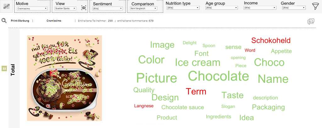
You receive heatmaps with aggregated data as a result. You can conveniently retrieve and smartly filter these in our dashboard developed especially for SKOPOS HEATMAP. Automatic text analyses and comparisons between filter groups are also possible.
Thanks to the prepared visualization of the strengths and weaknesses of your concept, you get a compact and immediate insight into the results!
Your benefits at a glance
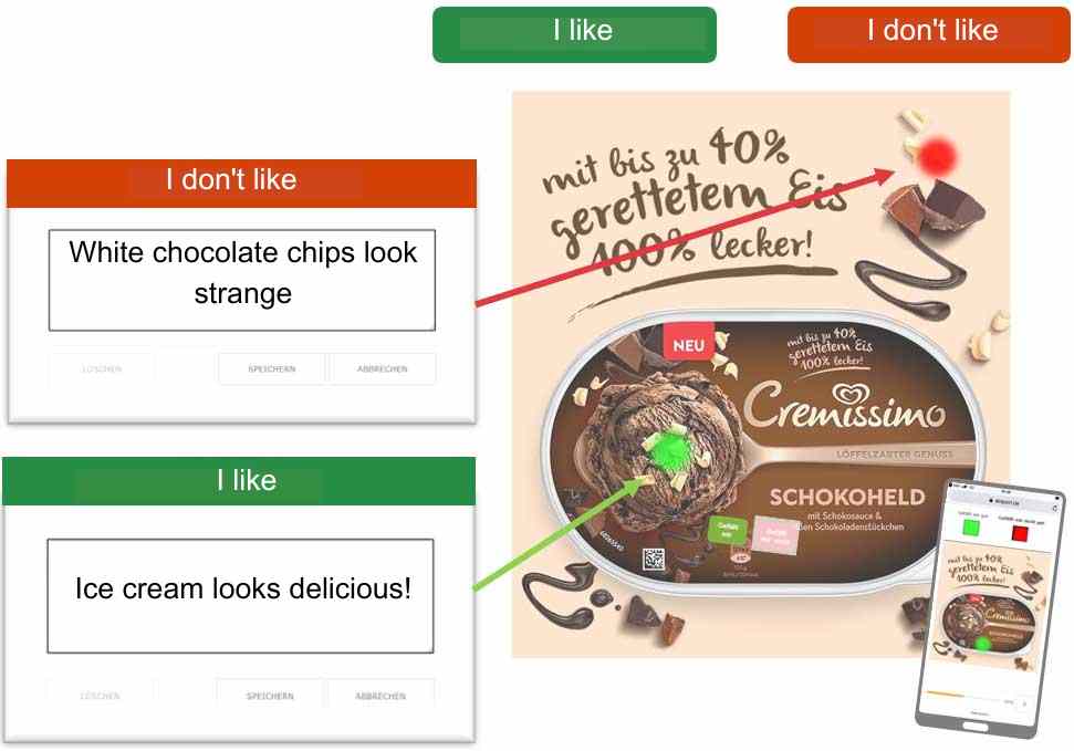
Respondents mark and comment likes & dislikes directly on the digital stimulus
Wide range of applications e.g. on packaging, advertising material, concepts, storyboards etc.
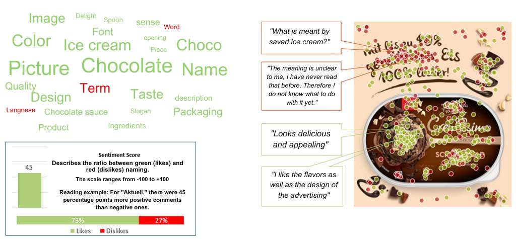
Automated analytics like word clouds and sentiment scores in a specialized interactive dashboard
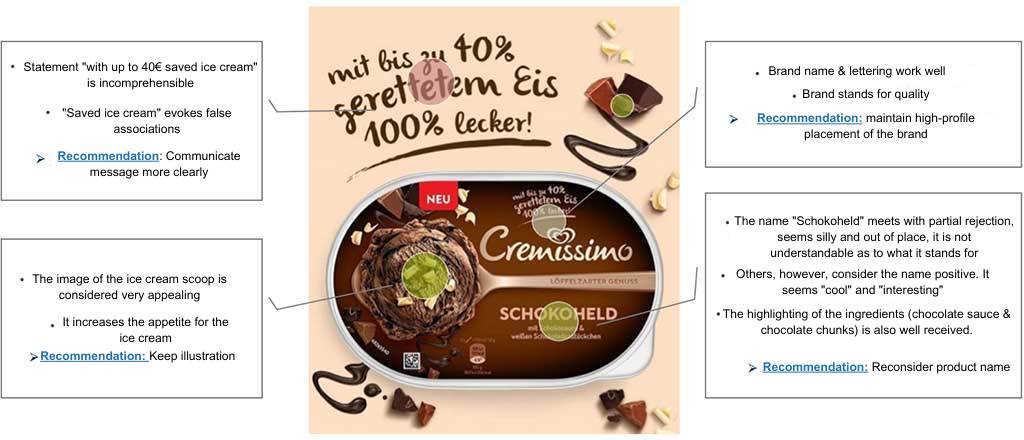
Additional qualitative detailed analysis of mentions and evaluation in powerpoint
The participant view: user-centric and mobile-friendly
In a user-centric way, survey participants can submit their opinions directly into the right space:
Our dashboard: individual and intelligent
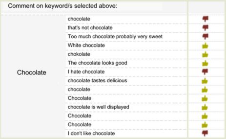
All results can be conveniently accessed and smartly filtered in our dashboard, which was developed specifically for you. Comparisons between filter groups are also possible. On your desktop, for example, you will be presented with this picture. Relevant results are clearly visualized, original answers of the participants can be viewed directly.
Outstanding mentions per keyword
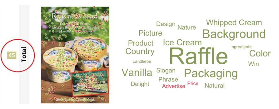
The evaluation in the dashboard not only allows you to analyze results down to the smallest detail, but with our sentiment score you also receive an overarching KPI for evaluating the tested packaging, ad, and concept variants. This makes it easy to compare and rank different alternatives, benchmarking compared to the competition is possible at a glance, and the comparison of different target groups is also transparent.
Various analysis options – the choice is yours!
You can choose from two different analysis packages – according to your needs.
Would you like to work with the data yourself, study the participant responses in detail, but you don’t need any additional qualitative analysis from us? Then the Basic option is the right choice for you. Here, we provide you with all contributions at a reasonable price in our special online dashboard.
Basic:
Online-Dashboard in Tableau
Would you prefer to receive an additional qualitative analysis of the participant contributions in PowerPoint from us? Then we recommend the Expert option, in which we provide you – in addition to our special online dashboard – with a targeted derivation of the existing optimization potential and a comprehensive summary of the content.
Expert:
Online-Dashboard in Tableau
+ Detailauswertung in PPTX
(Presentation Sentiment Score, Worldcloud, qualitative detailed analysis + comments)
Heatmap analysis: evaluation example
Heatmap-Analyse: Heatmap-Analyse: Sentiment Score


